
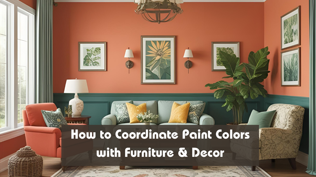
You’ve picked your dream sofa, chosen the perfect coffee table, and found that statement rug—but how do you tie it all together with the right wall color? Choosing paint isn’t just about what looks good on a swatch; it’s about coordinating with your furniture and decor to create a cohesive, stylish home. This guide breaks down how to match paint colors with your existing pieces, so every room flows with harmony, contrast, and professional polish.
Overview: Color Coordination Basics
| Coordination Element | Paint Color Strategy | Why It Works | Pro Tip |
|---|---|---|---|
| Sofa / Large Furniture | Choose a complementary or contrasting hue | Sets the tone for the entire room | Use a lighter or darker shade nearby |
| Rugs & Curtains | Pull a color from patterns | Ensures visual connection | Match trim or accent wall to rug base |
| Wood Furniture | Match with warm or cool undertones | Maintains tonal consistency | Don’t mix cool walls with warm woods |
| Accent Decor (Art, Vases) | Use wall color to highlight or frame it | Draws attention to focal pieces | Neutral walls make art pop |
| Metal Finishes | Align paint warmth with gold/silver tones | Prevents visual clash | Warm tones with brass; cool with chrome |
Step 1: Start with What You Own
Begin by evaluating your existing furniture and decor. Take note of:
- Dominant colors (sofa, cabinets, large rug)
- Undertones (warm like red/orange or cool like blue/green)
- Material textures (wood, metal, fabric)
This inventory will guide your wall color options, preventing mismatched themes.
Step 2: Identify the Dominant Undertone
Undertones affect how harmonious a color palette feels.
Warm Undertones: Cream, beige, rust, terracotta, warm wood
Cool Undertones: Grey, blue, white, black, silver
Rule of Thumb:
Stick to either warm or cool undertones across walls, furniture, and decor. Mixing them can feel jarring unless done with intent.
Step 3: Choose a Wall Color That Complements or Contrasts
- Complementary Colors blend into the overall scheme, creating calm and cohesion. For example, pairing a taupe couch with warm beige or off-white walls.
- Contrasting Colors add visual interest. For instance, using a soft blue wall behind an orange-brown leather chair makes both stand out.
Tip: If unsure, go neutral. You can never go wrong with light grey, warm white, or soft greige.
Step 4: Use the 60-30-10 Rule
This designer-approved rule helps balance color in any space:
- 60%: Dominant color (usually walls or large furniture)
- 30%: Secondary color (upholstery, curtains, large accessories)
- 10%: Accent color (throw pillows, vases, artwork)
Example:
- Walls: Light grey (60%)
- Sofa & rug: Navy blue (30%)
- Accent decor: Mustard yellow (10%)
Step 5: Let Patterns Lead the Way
If your rug, curtains, or pillows have patterns, pick one color from them to guide your wall choice.
Pattern Example:
- Rug with teal, beige, and charcoal
- Choose beige or soft charcoal for walls
- Use teal in smaller accents like artwork or vases
Step 6: Don’t Forget Lighting
Natural light enhances warm tones, while cool LED lighting can flatten certain colors. Always test paint samples on your wall at different times of the day, and under both daylight and artificial lighting.
Color Matching Table by Furniture Type
| Furniture Type | Ideal Paint Color Pairings | Avoid These Colors |
|---|---|---|
| White or Light Grey | Almost anything; try navy, sage | Stark white (can feel too sterile) |
| Tan or Beige | Olive green, terracotta, dusty blue | Yellow-based whites |
| Dark Wood | Soft white, warm beige, navy | Cool greys (may feel mismatched) |
| Black or Charcoal | Light neutrals, blush pink, sky blue | Dark walls (can feel heavy) |
| Colored Upholstery | Neutral walls in white, grey, cream | Walls in similar bold shades |
Common Mistakes to Avoid
- Matching everything exactly – It flattens the room and removes contrast.
- Ignoring undertones – Cool and warm tones must align across all elements.
- Choosing paint first – Always select furniture and rugs before paint; it’s easier to match paint than the other way around.
Conclusion
Coordinating paint with furniture and decor isn’t about playing it safe—it’s about creating flow and harmony throughout your space. By observing undertones, balancing contrast, and using design rules like 60-30-10, you’ll turn your rooms into magazine-worthy spaces that feel thoughtful and uniquely you. Remember: your wall color should frame, not fight, what you love.
FAQ’s
Q: Should I choose wall paint before or after buying furniture?
Always choose furniture first—paint is easier to adjust later.
Q: Can I mix warm and cool tones in one room?
Yes, but do so intentionally using one dominant temperature for balance.
Q: How do I test if a paint color matches my decor?
Paint swatches on the wall near furniture and view them in both natural and artificial light.