
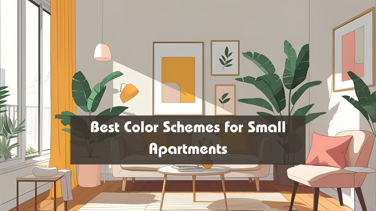
Living in a small apartment doesn’t mean you have to sacrifice style—or space. With the right color scheme, even the tiniest living area can feel open, airy, and thoughtfully designed. Whether you prefer soft neutrals, light pastels, or bold contrasts, the right colors can enhance your apartment’s lighting, create a sense of depth, and visually expand your rooms. This guide will walk you through the best color schemes for small apartments and how to use them smartly.
Overview: Top Color Schemes for Small Apartments
| Color Scheme Name | Key Colors Included | Best Used In | Mood/Effect Created | Ideal Pairing Tips |
|---|---|---|---|---|
| Soft Neutrals | White, Cream, Beige, Taupe | Living Room, Bedroom | Light, Spacious | Add textured fabrics and plants |
| Monochrome Grey | Light Grey, Charcoal, Dove Grey | Office, Hallways | Modern, Calm | Use metallic or glass accents |
| Pastel Hues | Powder Blue, Mint Green, Blush Pink | Bedroom, Study | Gentle, Airy | Works well with white furniture |
| High Contrast Black & White | Bright White, Jet Black | Kitchen, Living Area | Chic, Structured | Soften with wood or soft textiles |
| Warm Minimalist | Sand, Terracotta, Warm White | Dining Area, Balcony | Earthy, Cozy | Use clay pots, rattan, light wood |
| Cool Tones | Light Blue, Soft Teal, Seafoam Green | Bathroom, Studio Space | Refreshing, Open | Pair with silver or chrome fixtures |
Soft Neutrals: Bright, Timeless, and Airy
This classic palette reflects light and makes rooms appear more spacious. Shades of cream, white, and beige create a calming atmosphere and provide the perfect blank canvas.
Best For: Living rooms, bedrooms, entryways
Why It Works: Light tones reflect natural light, opening up tight spaces
Pro Tip: Add texture through throw pillows, rugs, or woven baskets to avoid a flat look
Monochrome Grey: Sleek and Space-Saving
Grey-on-grey may sound boring, but when layered right, it brings sophistication and continuity. A soft dove grey wall with darker grey furniture creates cohesion without overwhelming the space.
Best For: Office nooks, small hallways, modern kitchens
Why It Works: The single-color scheme keeps visual clutter to a minimum
Pro Tip: Add interest with brushed metal or chrome decor
Pastel Hues: Soft Color Without Overpowering
Pastel palettes bring gentle personality without shrinking the room. Powder blue, mint green, and blush pink add calm and charm, especially in bedrooms or cozy reading corners.
Best For: Bedrooms, study areas, bathrooms
Why It Works: Light colors enhance space while adding visual variety
Pro Tip: Keep furniture white or pale to maintain the airy feel
High Contrast Black & White: Bold Yet Balanced
Black and white color schemes create a visually structured look that works beautifully in compact kitchens or modern living rooms. It gives a crisp and contemporary vibe.
Best For: Kitchens, compact living areas
Why It Works: The stark contrast adds visual depth and sophistication
Pro Tip: Balance hard contrast with soft textures like curtains, cushions, or rugs
Warm Minimalist: Comfort in Earthy Tones
This palette uses natural colors like sandy beige, terracotta, and warm white to bring a sense of grounded coziness to small spaces. Great for those who love minimalism with soul.
Best For: Dining areas, balconies, studio corners
Why It Works: Warm tones feel comforting and inviting in tight quarters
Pro Tip: Add pottery, rattan chairs, or linen fabrics for texture
Cool Tones: Expand and Refresh
Cool tones like seafoam green, light blue, or soft teal create a refreshing and breezy environment. These are perfect for tiny bathrooms or open studio layouts.
Best For: Bathrooms, compact studios
Why It Works: Cool colors visually recede, making the space feel larger
Pro Tip: Use mirrors and glass surfaces to amplify the open feeling
Bonus Table: Color Scheme by Room Type
| Room Type | Suggested Color Scheme |
|---|---|
| Living Room | Soft Neutrals or Black & White |
| Bedroom | Pastel Hues or Warm Minimalist |
| Kitchen | Black & White or Monochrome Grey |
| Bathroom | Cool Tones or Pastel Hues |
| Balcony/Outdoor | Warm Minimalist |
Conclusion
When you live in a small apartment, every design choice counts—especially color. Choosing the right color scheme can dramatically influence how open, cozy, or vibrant your home feels. Whether you opt for calming neutrals, cool pastels, or bold contrasts, the key is to maintain harmony, enhance lighting, and avoid visual clutter. With these carefully chosen color schemes, your small space can feel not just bigger—but better.
FAQs
Q: Which colors make small apartments look bigger?
Light neutrals and cool tones like white, cream, and pale blue reflect light and expand space.
Q: Can I use dark colors in a small apartment?
Yes, but use them as accents or on one wall to create depth without overwhelming the space.
Q: What’s the most versatile color scheme for any room?
Soft neutrals like beige, white, and taupe work with nearly every design style and room type.